Brool brool (n.) : a low roar; a deep murmur or humming
Implications Of Fitt's Law
Tuesday design rant.
Fitt’s Law (discovered in 1954![1]) is a simple formula that describes the amount of time that will be needed for the average user to click on a target on the screen. From the UsabilityFirst.com glossary:
$$ T = k \; log_2(\frac{D}{S} + 0.5) $$
T = time to move the hand to a target
D = distance between hand and target
S = size of target
Really, it’s simple:
- The closer, the faster
- The bigger, the faster
Things at the edge of the screen are treated as if they have infinite dimensions off screen; thus, Fitt’s law dictates that things on the edge of the screen are the easiest to reach. Simple enough. Unfortunately, this rule is frequently broken.
Search Results
But let’s take a (bad) example. There are many sites that need to display multiple pages of information. Often this will be as a result of a search, but you will also see this frequently in forums. Commonly, they will show pages like so:
This is just crazy. To navigate to the next page, one of the most common operations, you need to carefully navigate the mouse to a 8 pixel-wide area and click it. To make this worse, some sites use a smaller font for the page numbers, which makes it even harder to click on them. This has been mentioned elsewhere, as well[3]; but why do people keep doing it?
Ooops Corollary
However, I would like to postulate the existence of a corollary to Fitt’s Law, which I call the “Ooops Corollary.” It is based on the simple observation that, if you misclick, you are most likely to click something immediately next to the desired target. Obvious! You should not make the consequences of a wrong click drastic. What this means in practice, however, is that you shouldn’t put dangerous operations next to common operations. And, if you must put dangerous operations next to common operations, at least make them undoable!
Want a concrete example? How about something that has been a flaw in just about every IDE in the world? Here’s is the menu from VC 6.0:
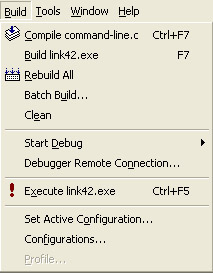
Take a closer look at the menu. A very common operation (“Build”) is right next to a file destroying, potentially time-consuming, non-undoable operation: “Rebuild All.” I’ve become particular creative with my cursing after accidentally kicking off a ten-minute build; the first thing the Rebuild All command does is delete all your object files, leaving you no choice but to let the build finish. Why are these operations put next to each other?
It’s like putting the self-destruct button for your secret base right next to the light switch: you’re just asking for problems later, when you aren’t paying attention.
Microsoft is particularly bad at this. They want to put related items close to each other for logical cohesion, which makes sense, but it still leads the user into dangerous situations. Imagine, for example, an executive that has a mailbox with thousands of messages in it. He is in the habit of marking something as “unread” if he isn’t ready to respond to it yet. It’s Friday afternoon, he has 98 different unread messages from the past two weeks, and he’s getting ready for the weekend. He reads a message, decides that he’ll answer it this weekend, so he right clicks and selects from the popup menu:
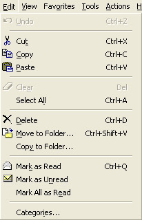
Whoops! Instead of selecting “Mark as Unread,” he accidentally selected the menu item right next to it, “Mark All Read.” Sorry about that, it’s an non-undoable operation. Have fun reading your hundreds of messages to try and figure out which should be unread. At a minimum the “Mark as Read” and “Mark as Unread” items should be swapped, but I’d prefer “Mark All as Unread” to be separated from the rest of the menu items by dividers, or maybe in a hierarchical — anything to make the destructive, non-undoable, rare operation more difficult to invoke.
Special Bonus Question
Question. In the context menu below for a USB Thumb drive, which two commands should not be located together?
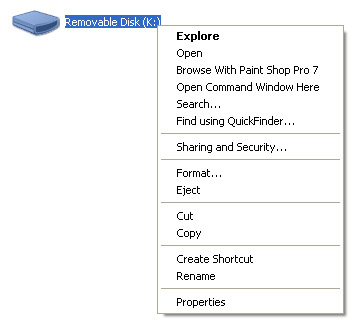
Answer. That’s right, why is the “Format” option right next to the “Eject” option?
[1] Fitt’s Law — At a
Glance
[2] AskTog: A Quiz Designed to Give You
Fitts
[3] Fitt’s UI Law Applied To The
Web
Discussion
Comments are moderated whenever I remember that I have a blog.
